Community Tip - New to the community? Learn how to post a question and get help from PTC and industry experts! X
- Subscribe to RSS Feed
- Mark as New
- Mark as Read
- Bookmark
- Subscribe
- Printer Friendly Page
- Notify Moderator
Define Your UI Style Part 2
- Step 4: Create and Implement State Definitions
- Step 5: Implementing Event-Based State Changes
- Step 6: Next Steps
Step 4: Create and Implement State Definitions
A state definition is a collection of style definitions, along with rules for when to apply each style definition. The rule plus the style definition is a state.
In the HelloWorldPlayground Mashup, if the Gauge Widget goes to 10 and the Increment the Count button is clicked once again, the Gauge starts back at 0. This value change is displayed in the Line Chart when it is refreshed. Nevertheless, it would be helpful to have a way to show a user that they’re encroaching 10 and will have to restart, such as the Gauge changing colors in the section. This and many other uses is where State Definitions become useful and go hand and hand with Style Definitions.
Create Style Definition to Represent State Change
First, let’s create Style Definitions to represent the changes in the count. The default Style Definition for a Gauge is the DefaultGaugeFaceStyle Style Definition. We can simply duplicate and update the new Style Definition for our own purposes.
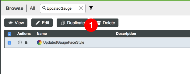
- Filter and click the checkbox next to the DefaultGaugeFaceStyle Style Definition.
Click Duplicate.
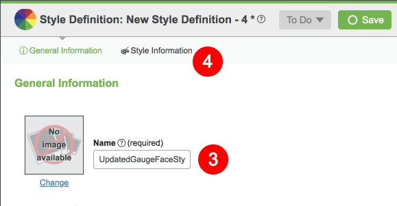
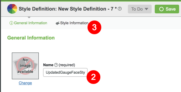
- Name the Style Definition UpdatedGaugeFaceStyle.
Click Style Information.
- Set the Display String property as AlarmingCount.
- Change the Background Color to light red (color code #D60000 is used in this example).
- Change the Secondary Background Color to a darker red (color code #960A0A is used in this example).
The inside line of the Gauge Widget is very thin. As an additional exercise, update the Line Thickness property and/or Line Color to see the effect.
Configure State Definition
Now let’s create a State Definition that will use both the default Gauge Style Definition and the one we just created.
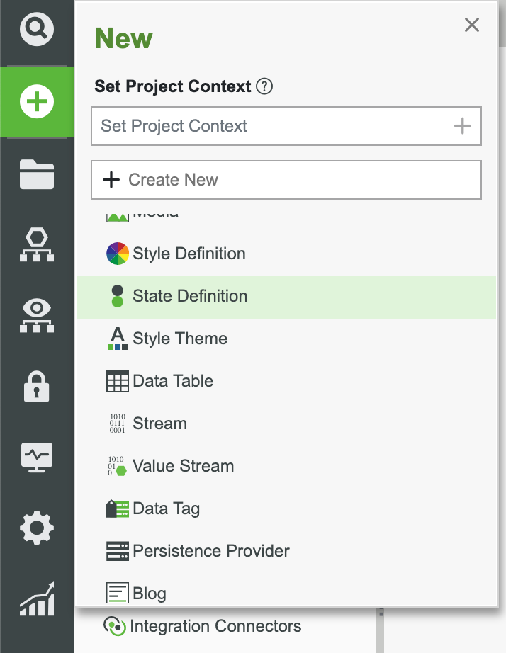
In the ThingWorx Composer, click the + New at the top of the screen.
Select State Definitions in the dropdown.
- Set the Project (ie, PTCDefaultProject).
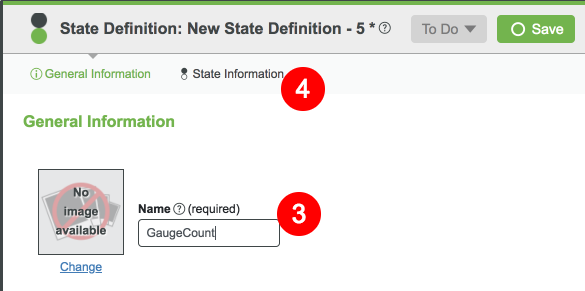
- Name the State Definition GaugeCount.
Click States Information.
- Set the Apply States dropdown to Numeric.
- Set the following values for the default state:
| Operator | Less than (<) |
| Value | 10 |
| Display Name | Under 10 |
| Style | DefaultGaugeFaceStyle |
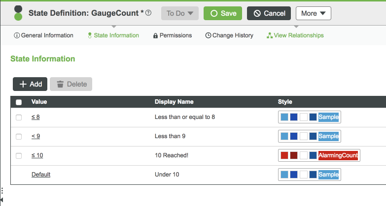
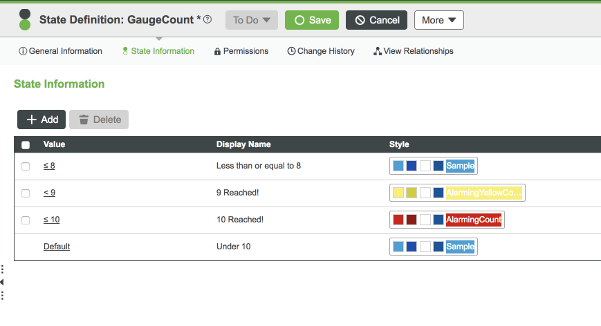
8. Click the Add State button to create the other states to match the below image:
9. Click Save.
You’ve now created a State Definition. If the value is below 10, the default Gauge format will be applied. Once the value reaches 10, notice the state-based changes you defined are displayed in the appearance of the Gauge.
Implement State Definition in Mashup
Update HelloWorldPlayground Mashup to incorporate the State-based formatting.
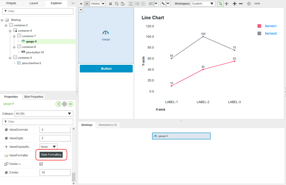
Select the Gauge Widget in the Workspace pane and click the ValueFormatter property.
- Select the State-based Formatting radio button.
Choose Count_Property for the Dependent Field drop-down and select the GaugeCount State Definition that we just created.
Click Done and Save the Mashup.
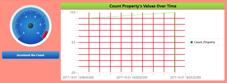
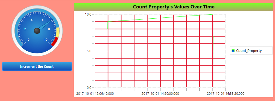
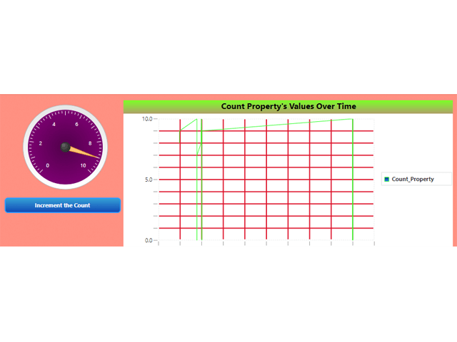
Click View Mashup. If you used the color schemes mentioned, your new HelloWorldPlayground Mashup should look like this.
- Click the Increment the Count button to see the state changes.
The Gauge now displays a visual indication for when the count is approaching 10.
Enhance State Definition
To further enhance the user experience, you could add another color that warns the user in advance before the threshold is reached. For this example, we will update our State Definition and create a Style Definition that uses the color yellow.
Duplicate the UpdatedGaugeFaceStyle Style Definition.
- Name the Style Definition UpdatedGaugeFaceStyle2.
Click Style Information.
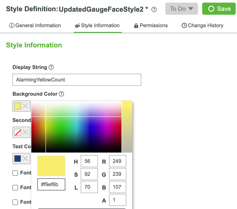
- Set the Display String property to AlarmingYellowCount.
- Set the Background Color property to yellow (color code #F9EF6B is used in this example).
Set the Secondary Background Color property to a darker yellow (color code #D2CD0E is used in this example).
Open the States Information tab of the GaugeCount State Definition.
Update the State Definition to fit the image below and utilize the Style Definition we just created:
- Click Save and View Mashup to see the updated runtime appearance of the application.
Step 5: Implementing Event-Based State Changes
The State and Style Definition you just implemented enables the Gauge to show users when the data property value is approaching the defined threshold. To increase the effectiveness of your application, you can define Event Handling processes that alert the user.
In this section we will explain two ways to handle the Event when the count is nearing the threshold value. One, with a Service that gets called whenever the Button Widget is clicked, and the other by using Expression Widgets.
Using a Service to Handle Events
In this part of the exercise, we will configure the Mashup so that once the Count hits 9, we will display a more drastically changed Gauge.
Adding Data Service
The below sections are based on the HelloWorldPlayground Mashup.
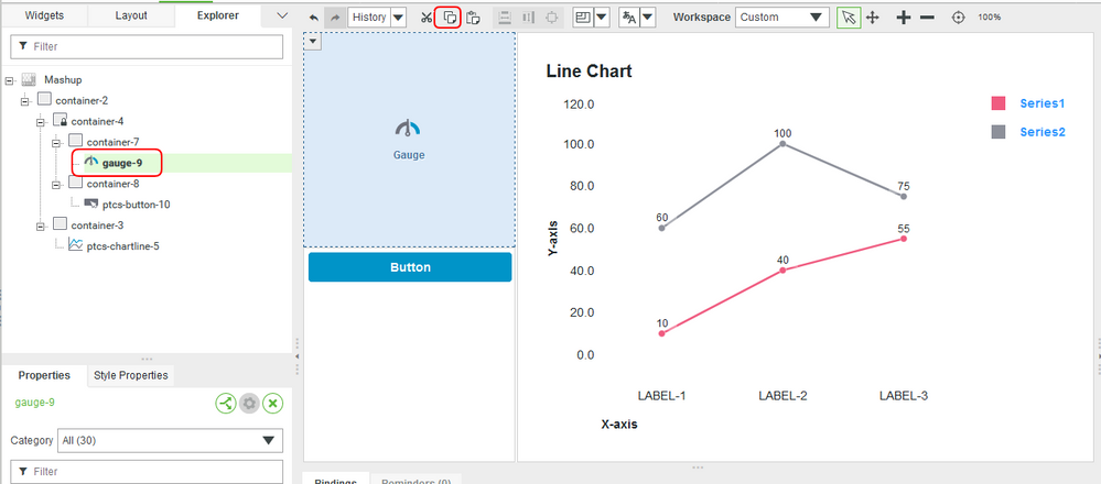
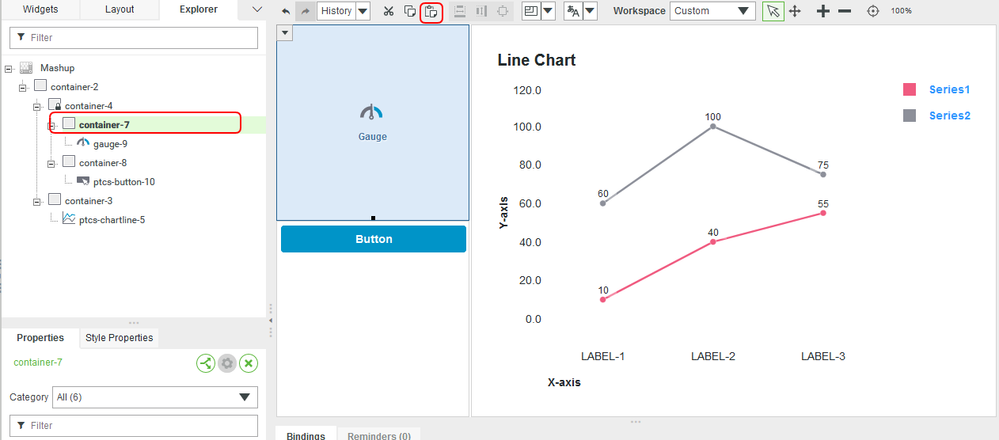
- Select the Gauge Widget in the Workspace pane.
- Click the Copy button in the toolbar.
- Select the Container in the Workspace pane.
Click the Paste button in the toolbar. If you Gauge Widgets will not go on top of one another, set the Z-index value of the new Gauge to a smaller number and set the Container Layout Position to static.
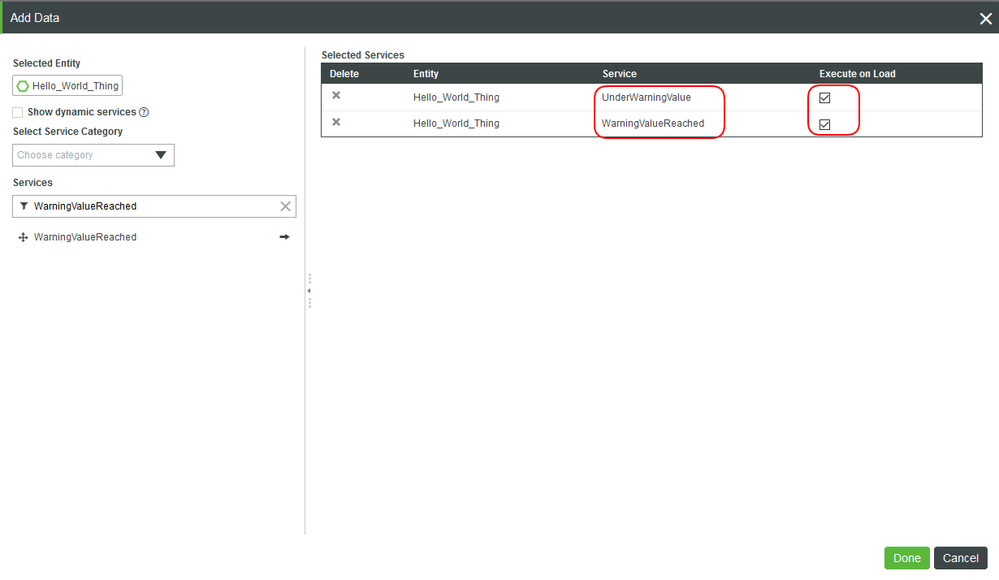
- Click the green Add Service button in the Data tab next to Things_Hello_World_Thing1 to add two services from you Things_Hello_World_Thing1 Entity.
NOTE: You just copied and pasted a Widget inside of a Mashup. While the Mashup retains the same property configurations and style definitions, the pasted Gauge will not have the same connections as the original Widget. You still need to define the inputs/outputs. For this new Gauge, we will only need to connect to the GetPropertyValues service.
6. Add the UnderWarningValue and WarningValueReached Services with the Execute on Load checked for both.
7. Click Done.
Binding Data and Event
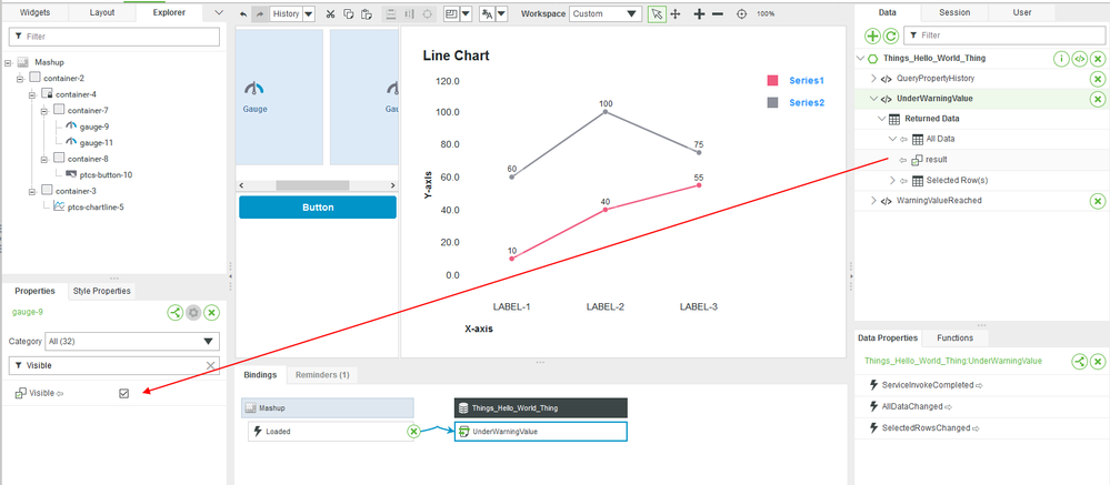
- With the original Gauge selected, scroll to the Visible property value.
Drag and drop the UnderWarningValue service result to the Visible property.
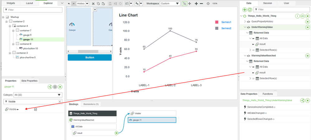
- With the new Gauge selected, scroll to the Visible property value.
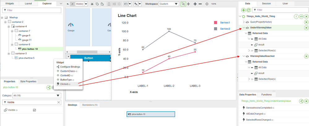
Drag and drop the WarningValueReached service result to the Visible property.
- Select the Button Widget in the Workspace pane.
- Drag and drop the Clicked Event to the UnderWarningValue and WarningValueReached services.
This will ensure the other Services are run whenever the Increment the Count button is clicked.
The UnderWarningValue service will return true if the Count property is under 9. The WarningValueReached service will return true if the Count property is equal to or above 9. The result sent to the original Gauge controls whether the Gauge is visible to users or not.
You could choose to implement a pop-up, alert, or another visual indicator to the UI that would inform your application users.
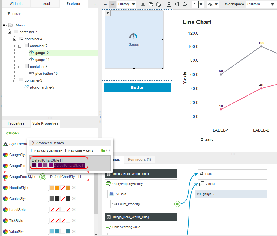
7. Select the new Gauge in the Mashup or Explorer pane.
8. Clear the GaugeFaceStyle Style Definition and replace it with the DefaultChartStyle11.
9. Click Save and View Mashup to see the changes.
Using Expression Widgets to Handle Events
Expression Widgets are a great asset to handle information being passed around inside of a Mashup and also events occurring within a Mashup. In this scenario, we will use the Count property value to create changes in the UI.
Setup Expression Widget
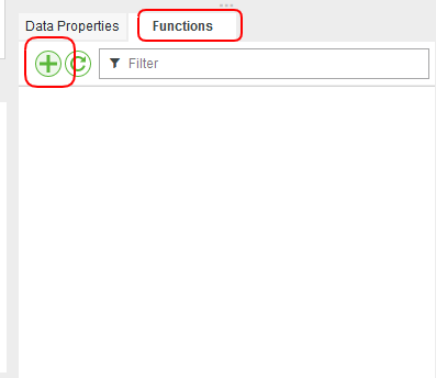
In the Functions Tab in the bottom right. Add a new function.
- Set the Function Type to Expression and name it HighCount.
- Click Next
- Click Add Parameter and add a Count (Number) parameter.
- Set the Expression property to output = Count >= 9;.
- Check the Auto Evaluate and Fire on First Value checkboxes.
- Click Done.
Bind and Evaluate Event
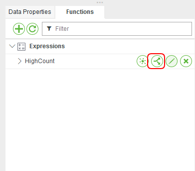
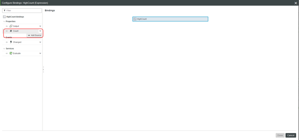
- In the Functions Tab in the bottom right, click the bind button of our new Function.
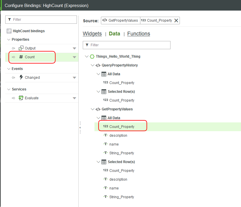
- Click the dropdown by the Count input parameter. Click Add Source.
Select Data, then the Count_Property from the GetPropertyValues service.
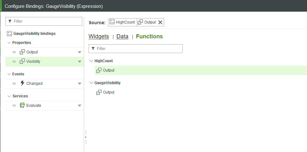
- Redo the past steps for a second Function. Name this function GaugeVisibility with a parameter of type Boolean with the name Visibility.
- Update the second Expression Widget’s Expression property to output = Visibility != true;.
- Ensure the checkboxes are checked and bind to the output of our last Function.
- Connect the output of this Function to the second Gauge.
- Click Save and View Mashup.
NOTE: Move the Gauges from on top of one another if necessary to set values and parameters. The first Expression will show the newest Gauge Widget when Count hits 9. The other Expression Widget will show the original Gauge based on the evaluation of the first Expression Widget results.
Click the Increment the Count button to see how the display changes in the Mashup at runtime.
Step 6: Next Steps
The next guide in the Customize UI and Display Options to Deploy Applications learning path is Object-Oriented UI Design Tips.
Additional Resources
If you have questions, issues, or need additional information, refer to:
Resource Link
| Community | Developer Community Forum |
| Support | Style & Themes Help Center |


