
Turn on suggestions
Auto-suggest helps you quickly narrow down your search results by suggesting possible matches as you type.
Showing results for
Turn on suggestions
Auto-suggest helps you quickly narrow down your search results by suggesting possible matches as you type.
Showing results for
Community Tip - Did you get called away in the middle of writing a post? Don't worry you can find your unfinished post later in the Drafts section of your profile page. X
Options
- Subscribe to RSS Feed
- Mark as New
- Mark as Read
- Bookmark
- Subscribe
- Printer Friendly Page
- Notify Moderator
Metrics for Model evaluation used in ThingWorx Analytics
No ratings
Metrics for Model evaluation used in ThingWorx Analytics
In ThingWorx Analytics, we consider different kinds of metrics to evaluate our models. The choice of metric completely depends on the type of model and the implementation plan of the model. After you are finished building your model, these 3 metrics will help you in evaluating your model accuracy.
Here are below further explanations about the 3 metrics used.
1-The ROC Curve:
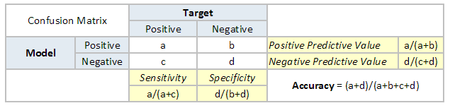
To understand what is ROC (Receiver operating characteristic) curve, let's look at the confusion matrix below. We observe that for a probabilistic model, we get a different value for each metric.
Hence, for each sensitivity, we get a different specificity. The two vary as follows:
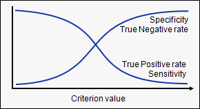
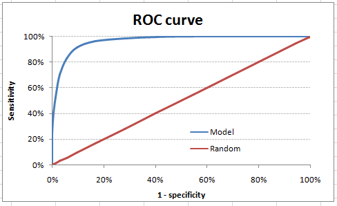
The ROC curve is the plot between sensitivity and (1- specificity). (1- specificity) is also known as false positive rate and sensitivity is also known as True Positive rate. Following is the ROC curve for the case in hand
Let’s take an example of threshold = 0.5 (refer to confusion matrix). Here is the confusion matrix:
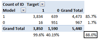
As you can see, the sensitivity at this threshold is 99.6% and the (1-specificity) is ~60%. This coordinate becomes on point in our ROC curve. To bring this curve down to a single number, we find the area under this curve (AUC).
Note that the area of the entire square is 1*1 = 1. Hence AUC itself is the ratio under the curve and the total area. For the case in hand, we get AUC ROC as 96.4%. Following are a few thumb rules:
- .90-1 = excellent (A)
- .80-.90 = good (B)
- .70-.80 = fair (C)
- .60-.70 = poor (D)
- .50-.60 = fail (F)
We see that we fall under the excellent band for the current model. But this might simply be over-fitting. In such cases, it becomes very important to have in-time and out-of-time validations.
Points to Remember:
- For a model which gives a class as an output, it will be represented as a single point in ROC plot.
- Such models cannot be compared with each other as the judgment needs to be taken on a single metric and not using multiple metrics. For instance, a model with parameters (0.2,0.8) and model with parameter (0.8,0.2) can be coming out of the same model, hence these metrics should not be directly compared.
2-Root Mean Squared Error (RMSE)
RMSE is the most popular evaluation metric used in regression problems. It follows an assumption that error are unbiased and follow a normal distribution. Here are the key points to consider on RMSE:
- The power of ‘square root’ empowers this metric to show large number deviations.
- The ‘squared’ nature of this metric helps to deliver more robust results which prevent canceling the positive and negative error values. In other words, this metric aptly displays the plausible magnitude of the error term.
- It avoids the use of absolute error values which is highly undesirable in mathematical calculations.
- When we have more samples, reconstructing the error distribution using RMSE is considered to be more reliable.
- RMSE is highly affected by outlier values. Hence, make sure you’ve removed outliers from your data set prior to using this metric.
- As compared to mean absolute error, RMSE gives higher weighting and punishes large errors.
3-Pearson Correlation Coefficient
This metric measures how highly correlated are two variables and is measured from -1 to +1.
A Pearson Correlation Coefficient of 1 indicates that the data objects are perfectly correlated but in this case, a score of -1 means that the data objects are not correlated. In other words, the Pearson Correlation score quantifies how well two data objects fit a line.
There are several benefits to using this type of metric. The first is that the accuracy of the score increases when data is not normalized. As a result, this metric can be used when quantities (i.e. scores) varies. Another benefit is that the Pearson Correlation score can correct for any scaling within an attribute, while the final score is still being tabulated. Thus, objects that describe the same data but use different values can still be used. The below figure demonstrates how the Pearson Correlation score may appear if graphed.
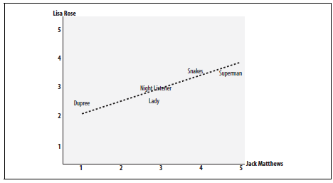
The chart demonstrates the Pearson Correlation Coefficient. The axes are the scores given by the labeled critics and the similarity of the scores given by both critics in regards to certain an_items.
In essence, the Pearson Correlation score finds the ratio between the covariance and the standard deviation of both objects. In the mathematical form, the score can be described as:

In this equation, (x,y) refers to the data objects and N is the total number of attributes
