
Turn on suggestions
Auto-suggest helps you quickly narrow down your search results by suggesting possible matches as you type.
Showing results for
Turn on suggestions
Auto-suggest helps you quickly narrow down your search results by suggesting possible matches as you type.
Showing results for
Community Tip - Have a PTC product question you need answered fast? Chances are someone has asked it before. Learn about the community search. X
- Community
- ThingWorx
- ThingWorx Developers
- Make textbox visible / not visible on button click
Options
- Subscribe to RSS Feed
- Mark Topic as New
- Mark Topic as Read
- Float this Topic for Current User
- Bookmark
- Subscribe
- Mute
- Printer Friendly Page
Make textbox visible / not visible on button click
Dec 03, 2015
05:32 PM
- Mark as New
- Bookmark
- Subscribe
- Mute
- Subscribe to RSS Feed
- Permalink
- Notify Moderator
Dec 03, 2015
05:32 PM
Make textbox visible / not visible on button click
Is there a way to make a textbox widget alternate between visible and not visible based on a button click? I see the little arrow on the visible property, but I can't seem to connect it to the button "Clicked" property.
While I'm here, could I change the Label on the button when it's clicked?
Solved! Go to Solution.
Labels:
- Labels:
-
Extensions
-
Mashup-Widget
1 ACCEPTED SOLUTION
Accepted Solutions
Dec 04, 2015
12:41 PM
- Mark as New
- Bookmark
- Subscribe
- Mute
- Subscribe to RSS Feed
- Permalink
- Notify Moderator
Dec 04, 2015
12:41 PM
Actually, a straight forward way would be to use the 'Radio Button' widget. Create a 'State Definition' with two states/ values - one as 'true' and the other as 'false'. Now, assign this StateDefinition for the Radio Button's 'ButtonStates' property. Drag and drop 'SelectedValue' of the Radio Button onto the Textbox, and now you should be able to select the 'Visible' property. Based on which side of the Radio Button you click, the visibility of the Textbox will change. Let me know if that works.
6 REPLIES 6
Dec 04, 2015
07:59 AM
- Mark as New
- Bookmark
- Subscribe
- Mute
- Subscribe to RSS Feed
- Permalink
- Notify Moderator
Dec 04, 2015
07:59 AM
Hi,
you can create a service like this:
- input: boolean, binded with the textbox "visible"
- ouput: boolean, binded to the textbos "visible"
- snippet: var result = !input;
Bind the button "clicked" to this service. Bind this service "ServiceInvokeComplete" to the textbox
If the button Label accept a connection (showed by an arrow), then the Label can be changed with a service.
Dec 04, 2015
09:42 AM
- Mark as New
- Bookmark
- Subscribe
- Mute
- Subscribe to RSS Feed
- Permalink
- Notify Moderator
Dec 04, 2015
09:42 AM
Bill, as 'Clicked' is an event, you won't be able to bind it to a property. You can use a service like QuangDung suggested.
Regarding changing the Label dynamically (or once it is clicked), that is not possible at the moment. ContextId, Disabled, ToolTipField and Visible are the only properties that take inputs.
Dec 04, 2015
10:23 AM
- Mark as New
- Bookmark
- Subscribe
- Mute
- Subscribe to RSS Feed
- Permalink
- Notify Moderator
Dec 04, 2015
10:23 AM
Thanks for the quick reply and I see where you are going with this. However, the "visible" property of the textbox is input only. There doesn't seem to be a way of knowing the current state.
Also, when you suggest to bind the "ServiceInvokeComplete to the textbox" which property of the textbox are you referring?
Dec 04, 2015
12:41 PM
- Mark as New
- Bookmark
- Subscribe
- Mute
- Subscribe to RSS Feed
- Permalink
- Notify Moderator
Dec 04, 2015
12:41 PM
Actually, a straight forward way would be to use the 'Radio Button' widget. Create a 'State Definition' with two states/ values - one as 'true' and the other as 'false'. Now, assign this StateDefinition for the Radio Button's 'ButtonStates' property. Drag and drop 'SelectedValue' of the Radio Button onto the Textbox, and now you should be able to select the 'Visible' property. Based on which side of the Radio Button you click, the visibility of the Textbox will change. Let me know if that works.
Dec 05, 2015
04:37 AM
- Mark as New
- Bookmark
- Subscribe
- Mute
- Subscribe to RSS Feed
- Permalink
- Notify Moderator
Dec 05, 2015
04:37 AM
Hi,
I was too quick when I replied, sorry. Here is the solution.
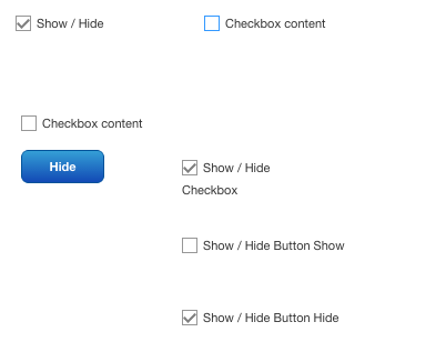
1) If it's ok to have a checkbox "Show / Hide" which make visible/invisible another checkbox "Content", it's a lot easier. We just need to bind the the first checkbox State to the second checkbox Visible.
2) If a button is really needed, I will still use a checkbox "Show / Hide" like the solution above. The button will change the state of this check box, with a service like this:
Service name: ShowHideComponent
Input: isShowing, BOOLEAN
Ouput: BOOLEAN
Script: var result = !isShowing
In the mashup, the input of this service will be the State of the checkbox "Show / Hide" and the ouput is this checkbox State too. And, the button Clicked event is binded to this service. Therefore, when the button is clicked, the state of the "Show / Hide" checkbox is changed, and the "Content" checkbox visible is changed. Finally, the "Show / Hide" checkbox Visible can be set to false, so the user only see the button and the "Content" checkbox.
3) Change the Label on the button when it's clicked
It's not possible to change it directly. The label is not a variable. But there's a way to create the same effect. The idea is using 2 buttons with 2 labels "Show" and "Hide". These 2 buttons will be showed and hided one after another. The user only see the same button with the label changed.
How to do it ? A third inivisible button is used to trigger this. A new transparent style is created and set to all style of the invisible button. The Z-index of this button must be bigger than these one of 2 other buttons (Show and Hide), so even it's invisible, it's on the top of 2 other buttons.
Two more "Show/Hide" checkboxes are used and two more same services ShowHideComponent are added to the mashup. The rest is the same as the step 2. When the invisible button is Clicked, the "Show/Hide" checkbox State is changed, and the button Visible is changed too. The button with the label "Show" will be loaded with the State true and the one with the label "Hide" will be loaded with the State false. The three buttons Invisible, Show and Hide are on the same place.
Hope this help
Dec 07, 2015
10:11 AM
- Mark as New
- Bookmark
- Subscribe
- Mute
- Subscribe to RSS Feed
- Permalink
- Notify Moderator
Dec 07, 2015
10:11 AM
Thanks again for the options. The Radio Button widget worked great.
I like the checkbox idea too and may give that a try if I have some time.


